01 September 2020
The icon of Rotterdam – a childhood dream
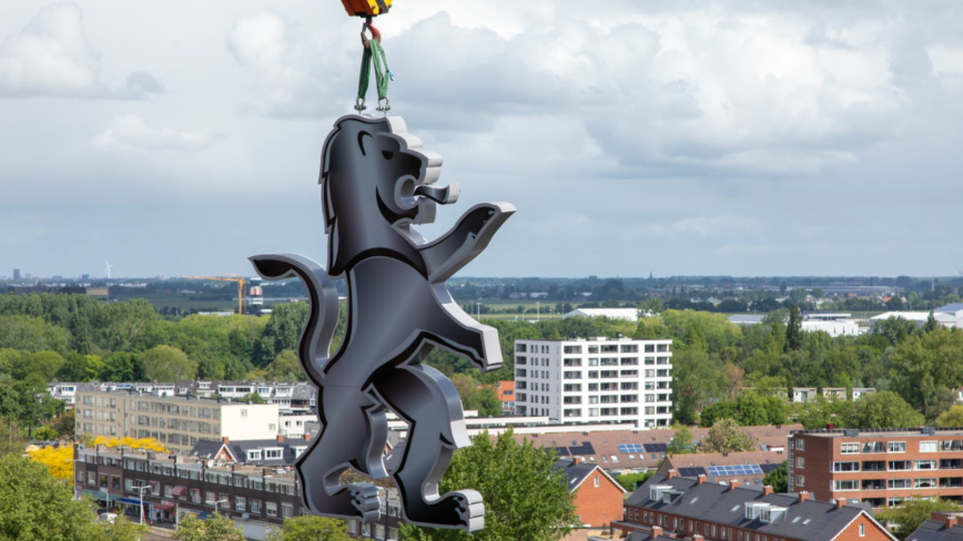
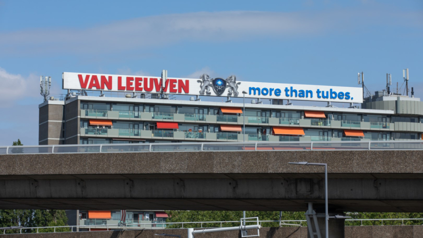
Creative director Edwin van Praet moved from Breda to Schiedam as a little boy. Every weekend he drove with his parents to his grandparents in Breda. On the way back on the motorway he always looked up to see the Van Leeuwen logo there. Then he knew, I’m home.
His passion for design began there on the Kleinpolderplein interchange. Especially when it was already dark and the logo lit up, he fantasised that one day he would also make such a logo in such an iconic place.
‘All Rotterdammers recognize the logo, they adore it. A poem has even been written about it,’ Edwin says, ‘In 2011, Total Design was asked to adapt the Van Leeuwen logo, along with the entire corporate identity. It was then that I knew my childhood dream would come true. People still drive past the logo, with the same thought: “we’re home again”.’
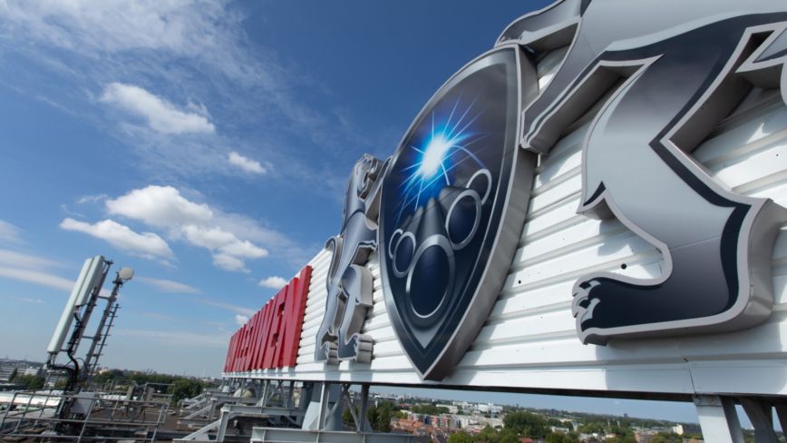
The new logo has been modernized and is therefore more contemporary. The pay-off ‘More than tubes’ is now part of the logo and the change in the corporate identity makes the brand more visible in all communications.
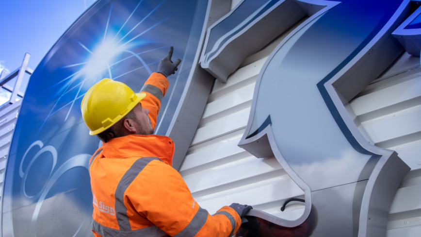
Now in 2020 the new logo has been placed on the building by Armada Janse and the story is complete. The Correspondent recently wrote a nice story (in Dutch) about how the iconic logo was replaced.
