With their new brand identity, HEMA is evolving back to basics
Total Design developed an adjusted visual identity for HEMA that seamlessly connects with the strategic course of HEMA.

Made with love
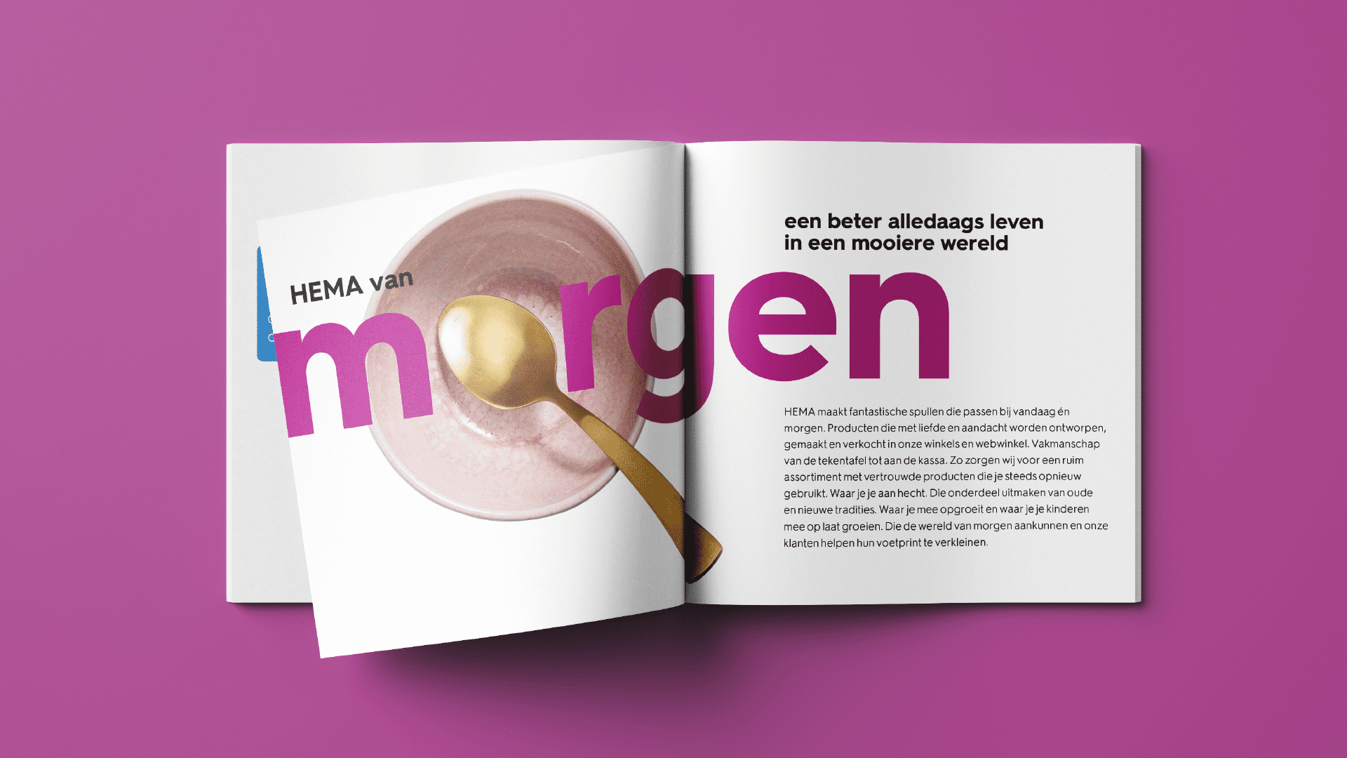
HEMA’s mission is: a better everyday life in a more beautiful world. At HEMA, therefore, everything is made with love, with a focus on practicality, beauty and design. Products that last longer. Products that are unique thanks to their recognisable ‘Dutch Design’ signature. All this while remaining affordable to everyone.
With the new strategic direction that HEMA took since the end of 2021, a refreshed and modern identity was needed. Total Design was asked to develop this rebranding, focusing on the future, while retaining the unique HEMA charm. Real Dutch Design; minimalistic, experimental, unconventional and with a sense of humor. An identity that only the HEMA brand can afford
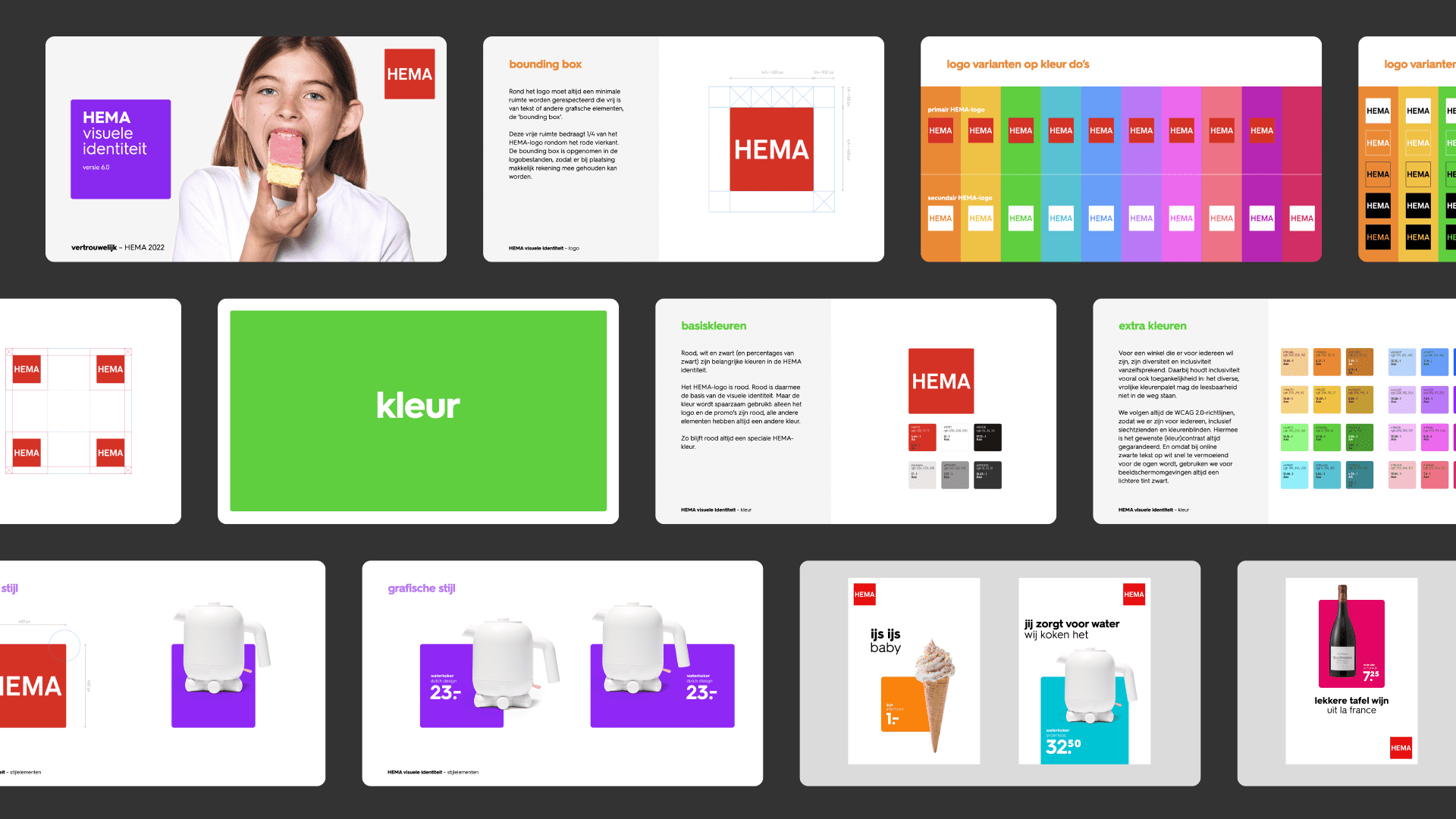
A modern identity
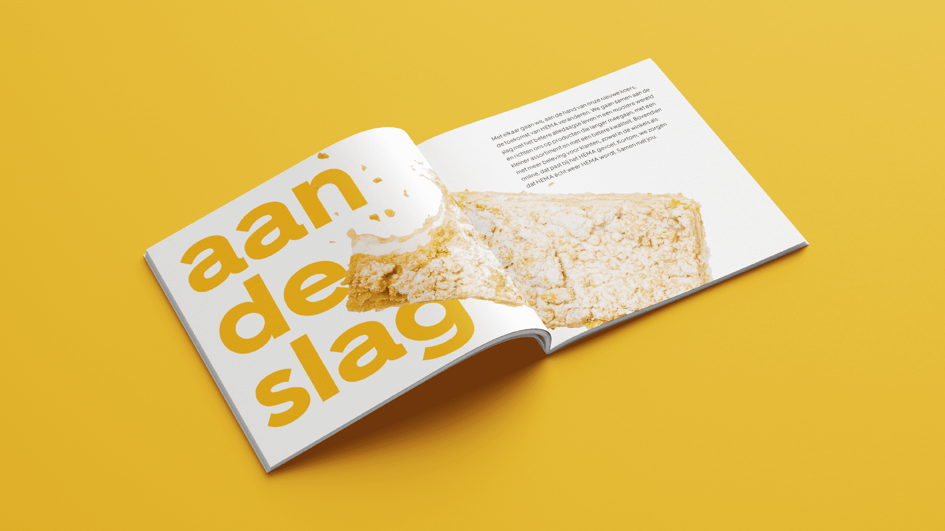
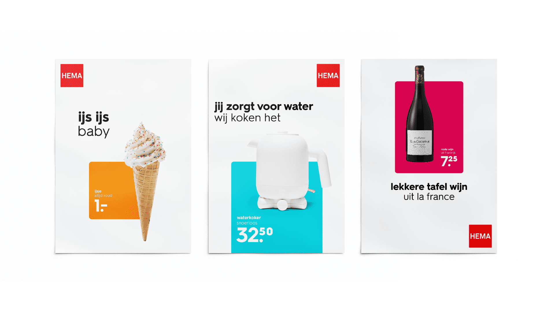
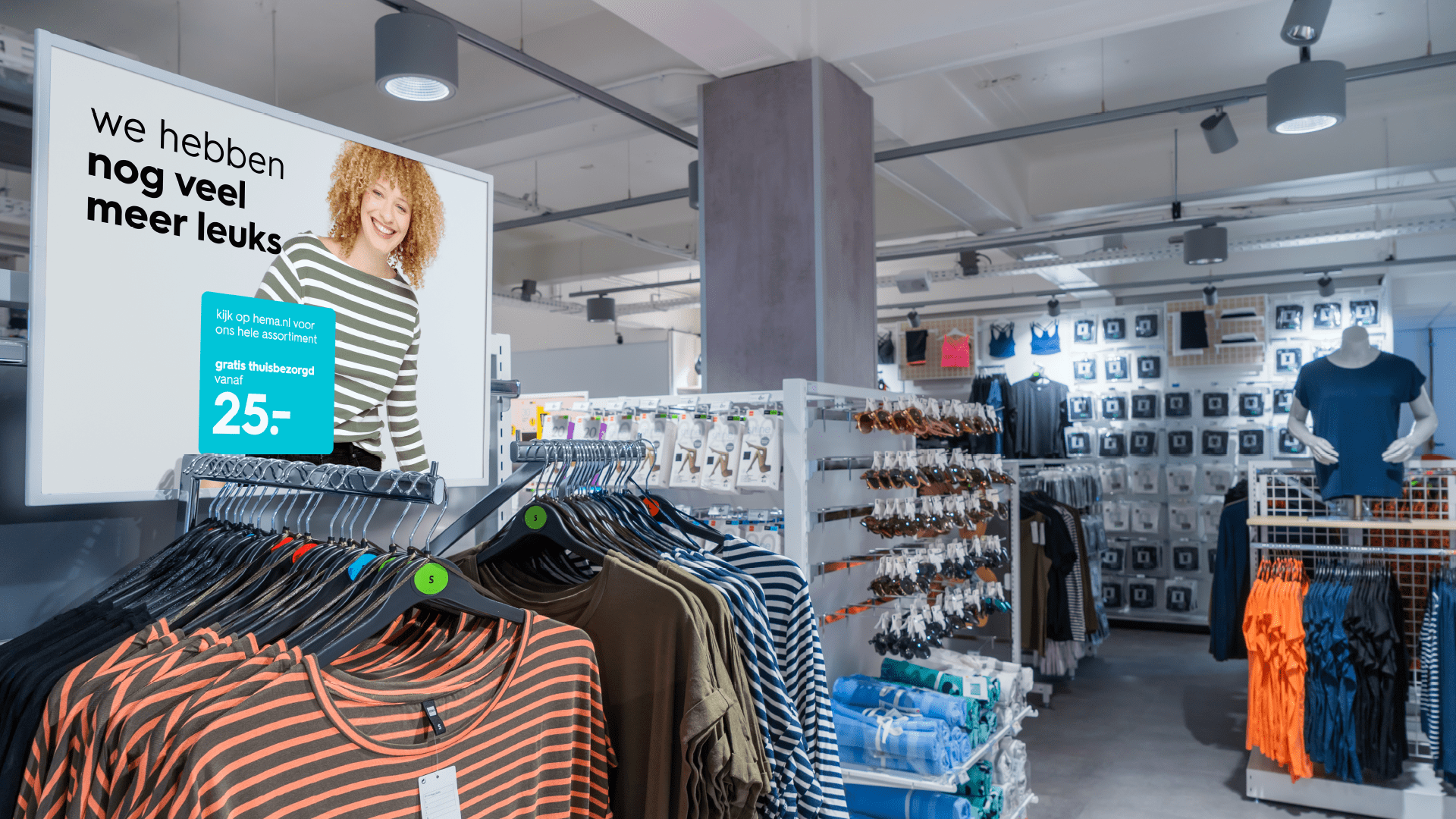
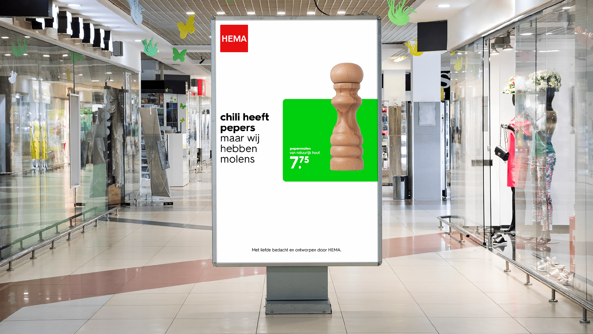
A clear and cheerful look was chosen, with plenty of openness and contrast. The use of white also makes it more daring. This allows more space for the stories behind the products. The unique HEMA products are literally given the stage and the special product features are highlighted.
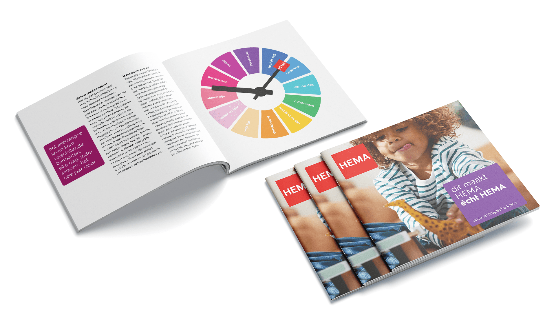
The well known red HEMA logo forms the basis of the visual identity. However, this red colour is used sparingly; only the logo and the promos are red, all other elements take advantage of a bold and colourful palette. The new and accessible colour palette was developed for a brand that wants to be there for everyone; diverse and inclusive. Whilst also representing the HEMA brand values: modern, cheerful, sober, brave and open. The palette consists only of colours that evoke positive feelings. Colours that make you happy. By keeping white as the primary colour, the whole remains sleek and sober.
Break with the past
Creative Director, Edwin van Praet, felt very comfortable with the assignment. He considers core values such as sustainability and quality, for which HEMA is known to be the perfect starting point. Back to basics is what I really like. HEMA is all about the art of leaving things out. The power of white. And the power of aesthetics. Getting to the essence.
The process started with a huge inventory. All colours, typography, images from the shop, packaging and advertising brochures were measured against the HEMA yardstick.
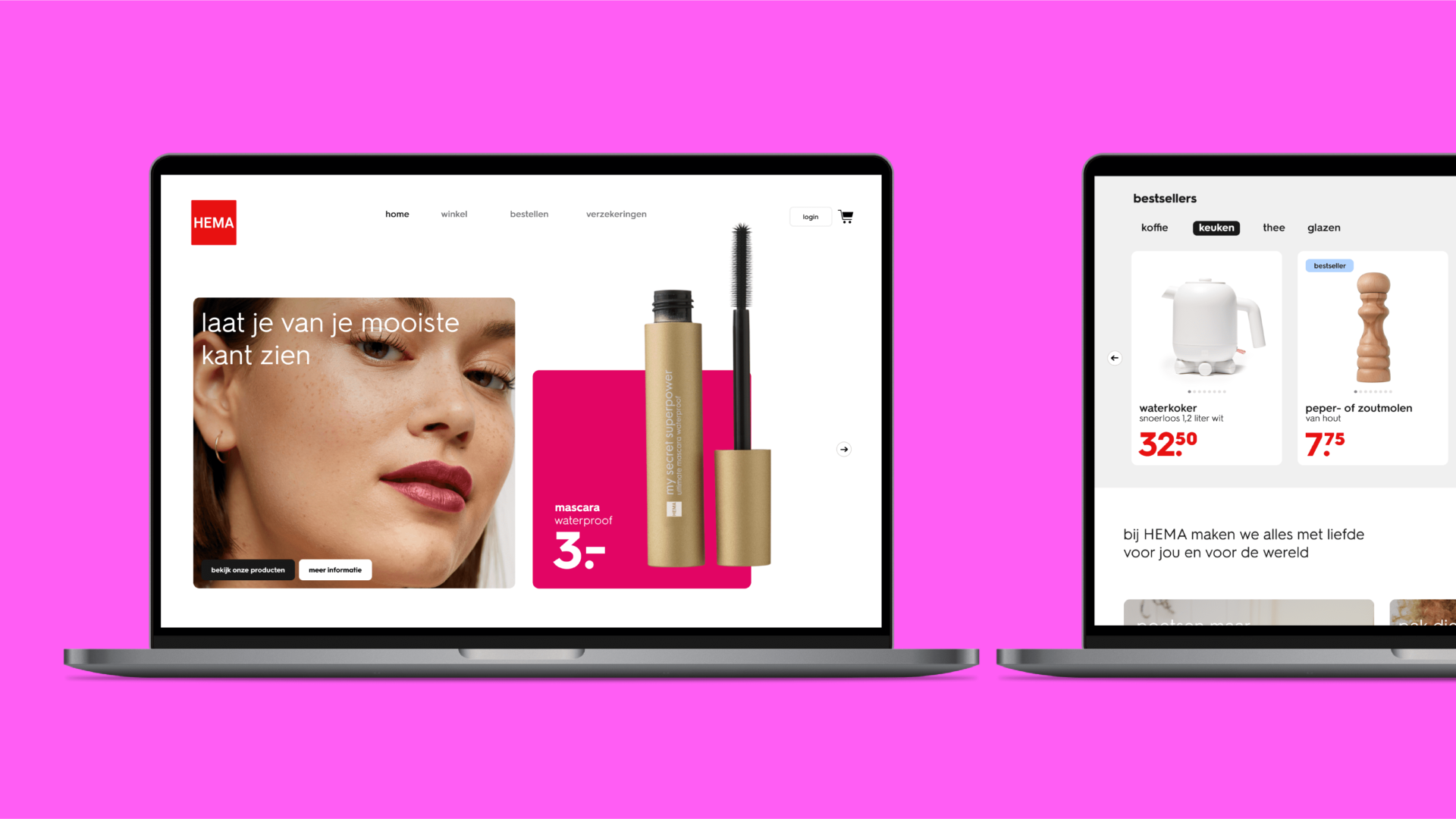
To make the brand future-proof, every barrier between HEMA and the target group had to be removed. This meant that both the lettering and the use of colour had to be adapted so that it reaches more people. A break with the past: not the colours and fonts suitable for print were selected, but the screen was the starting point. Van Praet: ‘This is how you create online visibility and readability for people with a disadvantage. At the same time, the design complies with the pillars of the brand identity: modern, cheerful, sober, brave and open.
Logo, white and grid
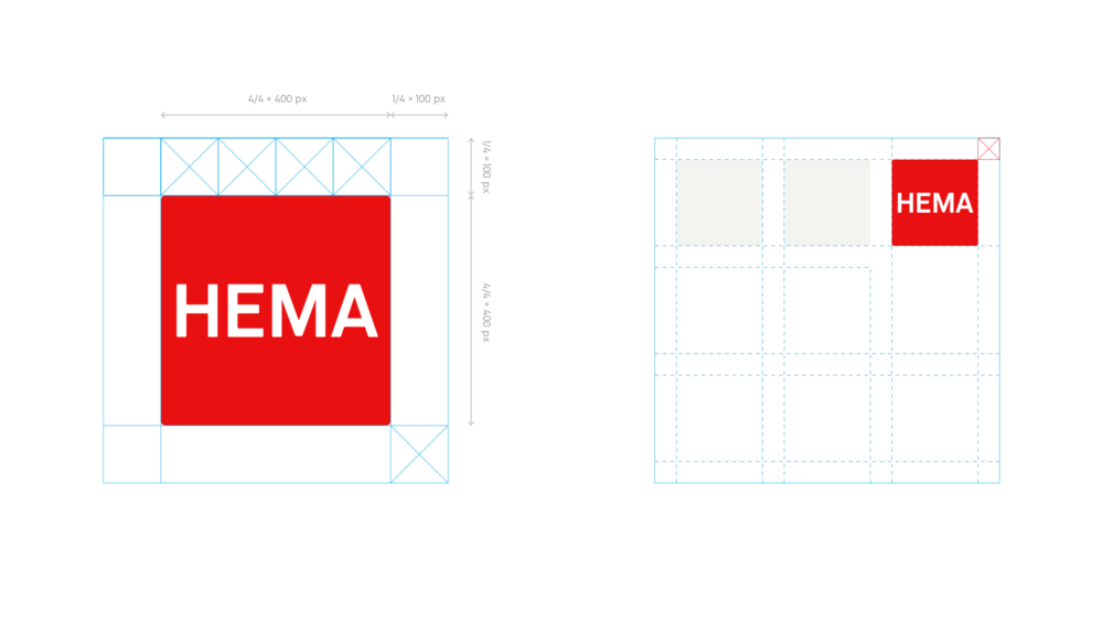
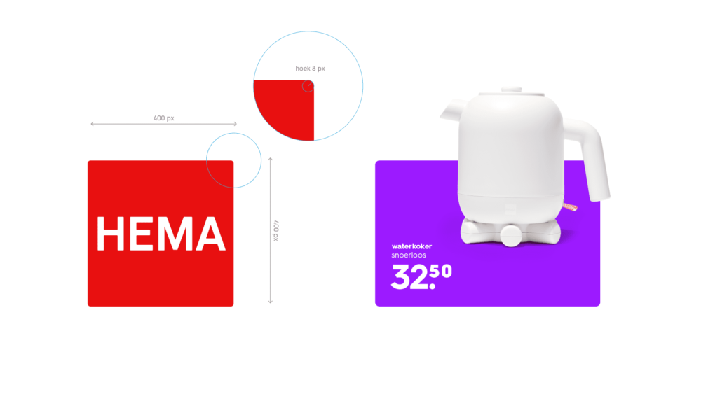
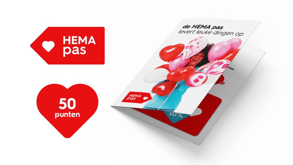
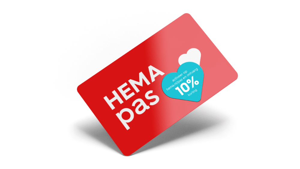
We use the basic element of the red surface with the rounded corners as the basic element for the brand identity. The red from the logo is only used in the logo and the price indications against a large, white background. In this way, we put the products on a stage with a lot of colour, so that they stand out. But everything with the right white/colour balance. Because white is the basis.

Colours
For the use of colour we use the so-called AA status. That means that we use colours that are also visible online for people who, for example, have a colour handicap or are partially sighted. We combine this with white or black. We now comply with the WCGA guidelines of the Dutch government.
Font
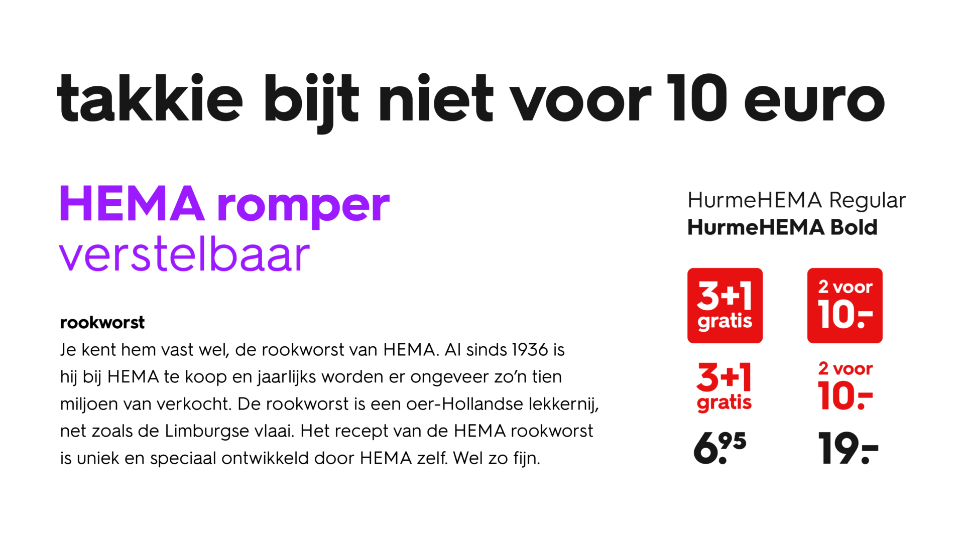
The FuturaHema has been replaced by a new typeface: the HurmeHEMA. The round character has been retained. The problem with the old typeface was, for example, the letters o and a. If you are dyslexic, there is a chance that you could confuse them. The same applied to t and i. For example, 10 euro could also be read differently. We’ve made that easier. More attractive and more readable
Icons
The icons went in all directions, here we also went back to the basics. With very simple and recognisable solutions that work well mobile-first.


Photography
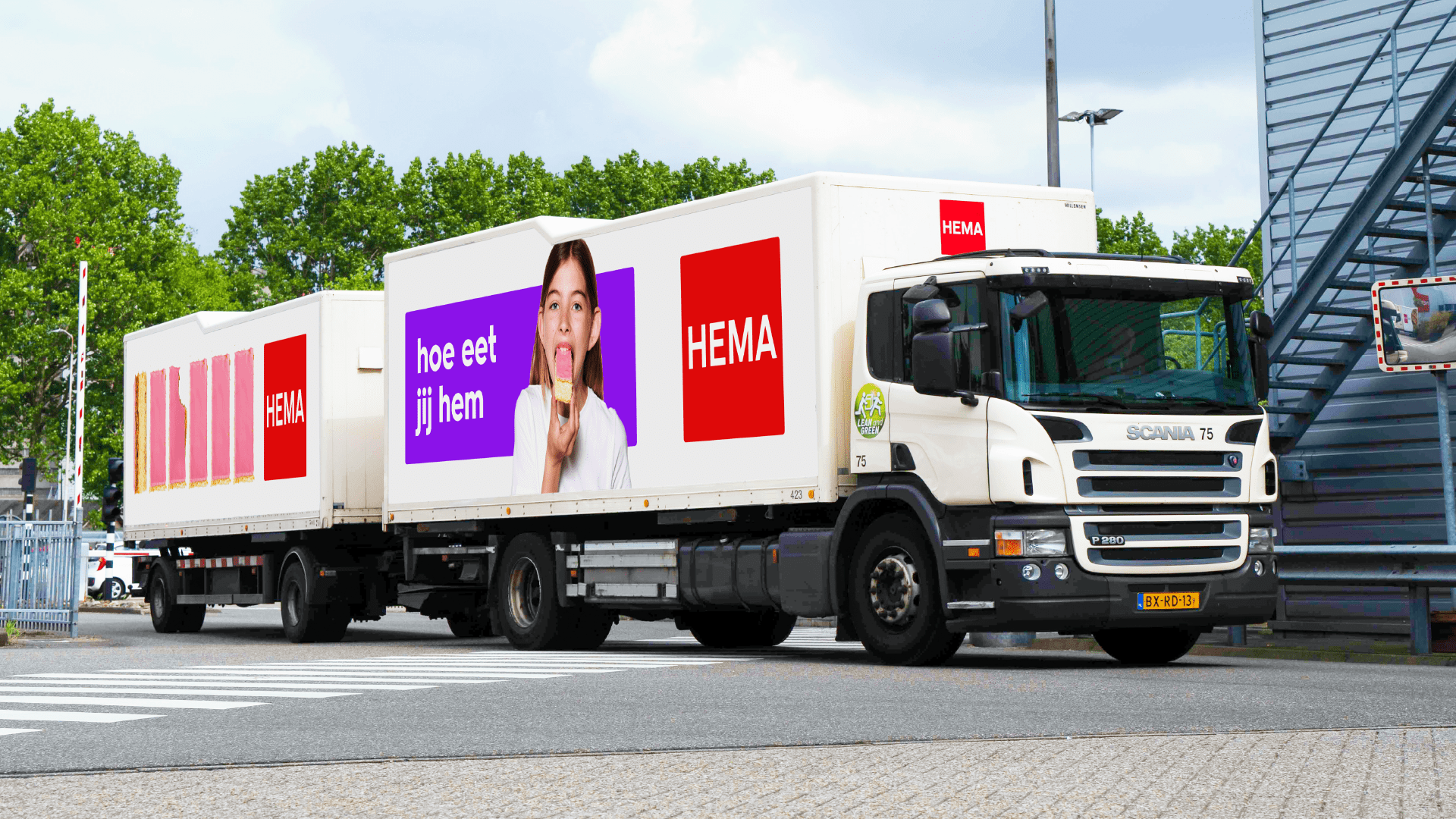
The photography must be continuously tested against the HEMA’s core values modern, cheerful, down-to-earth, brave and open. The components are divided into scenes taken from everyday life. Then there are the models, with characteristic heads. The products are iconically photographed as if they were a work of art. And finally the atmosphere, with that sunny and light glow.
Do you want your brand to be recognizable as well as distinctive? Get in touch with Henriette!
- Henriette Verkerk
- Head of Branding
- (+31) 06 439 923 96
- henriette@totaldesign.com
How can we help you?
Total Design believes in the power of difference. Different people from different disciplines: technology, communications and branding working together to help brands develop and grow.
Get to know usOops! We could not locate your form.