Nierstichting
Kidney Power
Challenge
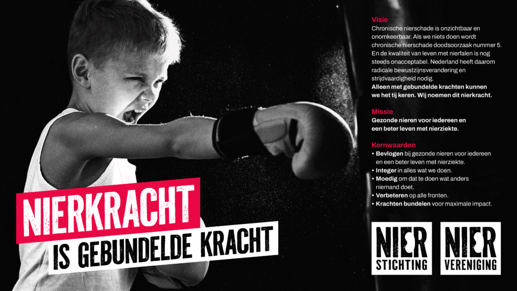
The Dutch Kidney Foundation and the Kidney Patients Association share one mission: to prevent kidney damage, support patients, and find solutions for kidney disease. Both organisations are driving change: leading campaigns for the donor law and developing the portable artificial kidney. They needed a sharper, more urgent identity that reflected their activism and innovation – and a shared positioning that united both voices into one powerful, visible, and mobilizing front.
Idea
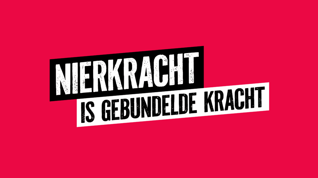
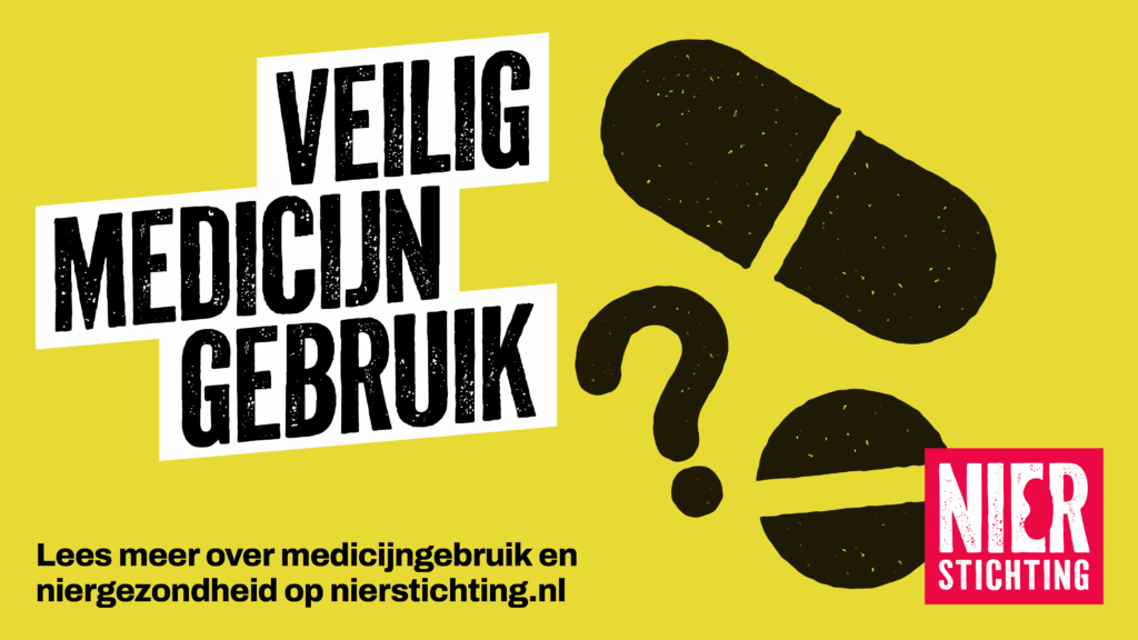
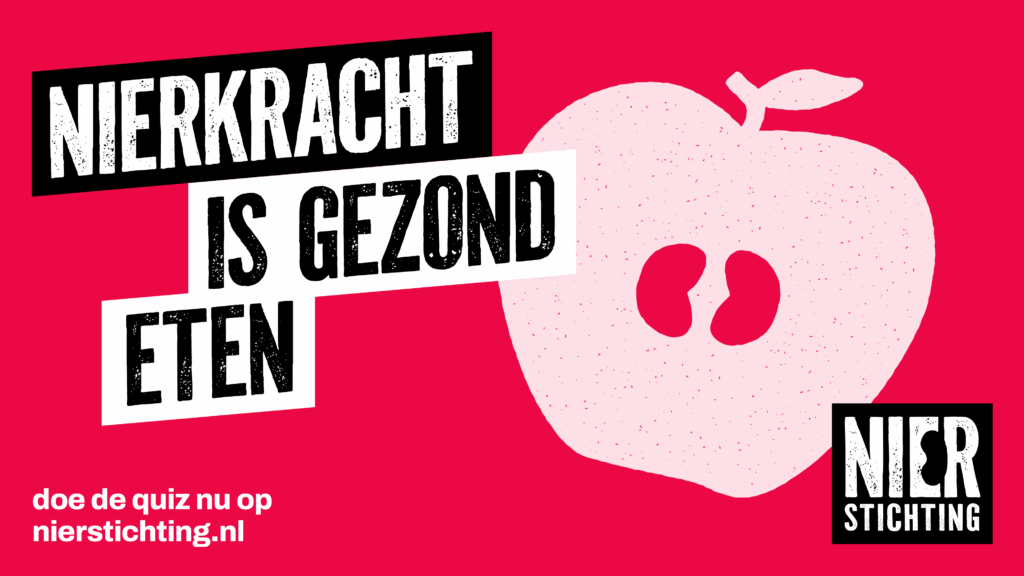
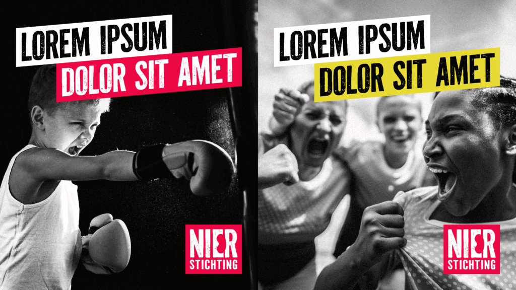
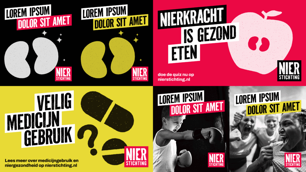
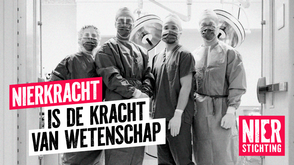
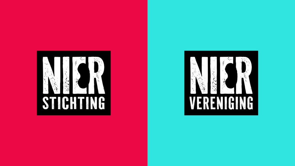
TD created an integrated repositioning: Nierkracht – Kidney Power. A concept that symbolises the collective strength of patients, professionals, researchers, volunteers, and donors working together to make a difference. The new identity expresses activism and connection. A subtle kidney shape is embedded in the logo, supported by bold typography and a harmonised colour palette combining both organisations’ styles. Photography and visual language are empathetic yet raw – showing reality with dignity and urgency. The first joint campaign, ‘Change a point (period) into a comma,” focused on living donation. The story of Aman and Akim – donor and recipient – showed how one’s personal choice can save lives and break cultural taboos.
Result
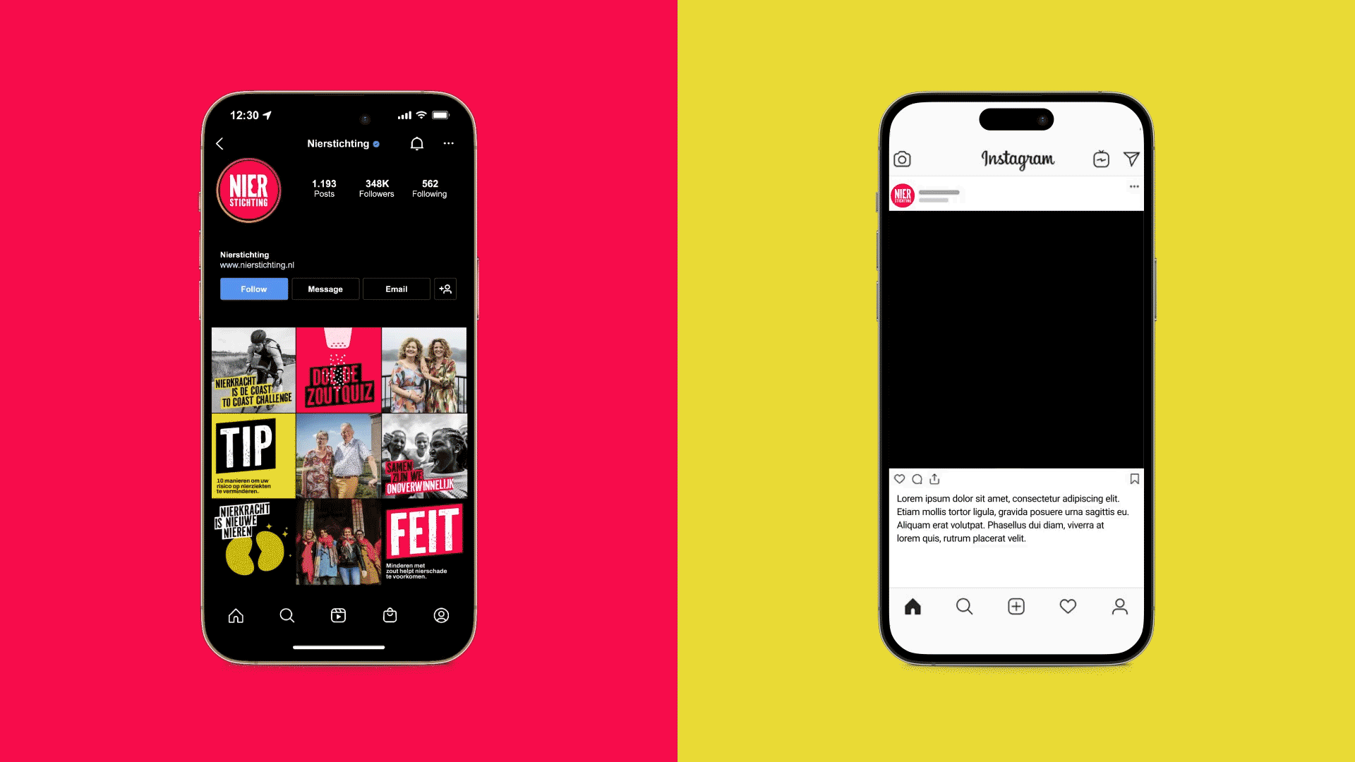
Nierkracht created one brand that unites fundraising, advocacy, and awareness.
The shared identity strengthens both organizations and gives them a clear, unified voice. It has evolved into an activist movement that touches, engages, and connects people – bringing visibility to pressing issues such as living donation.
Nierkracht proves the power of collaboration: when forces combine, they don’t just create a stronger brand, but a stronger front in the fight against kidney disease.