Red Dot Award landingspage Push Braces

Our trophy cabinet has a new inhabitant! This time it’s a Red Dot Award: Brand & Communication Design. In the Website Design category, we managed to impress the 30-member jury of experts with the landing page we created for Push Braces by Nea International. It scored highly on creativity, design quality, innovation, and impact.
Translating Freedom of Movement
The brand promise of Push Braces is freedom of movement: being able to move without pain or restrictions. This is achieved by developing and producing innovative braces that support a wide range of joint injuries and (chronic) conditions. We’ve been working with Push braces for several years now on all their brand communications. From exhibition stands and brochures to packaging and art direction for photo shoots.
A Rich Digital Experience
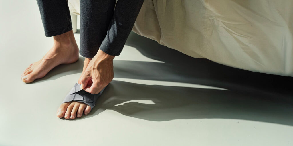
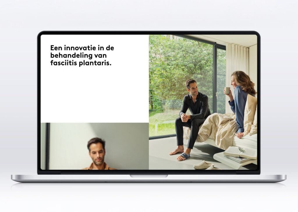
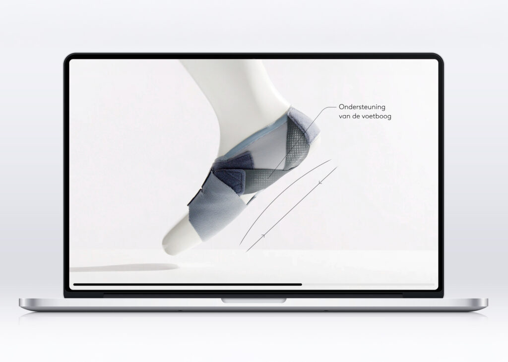
When launching a new product, we often use a distinctive one-pager as the hub of communication. That was the case for the Push® med Foot Brace FP, a new approach to treating plantar fasciitis. This one-pager visually weaves all product information into a single coherent and persuasive story that strengthens both the product and the brand. The informative product visuals are interspersed with lifestyle images that make the regained freedom of movement tangible. One of the highlights is a 360-degree video, that we morphed into an interactive infographic. Together, these elements create a seamless brand experience that serves two audiences simultaneously: professionals and end users.
Check the award-winning landing page
The one-pager concept by Zuiderlicht, launches our new product in the best possible way and creates a seamless Push Braces brand experience that appeals to both professionals and end users.


Red Dot Awards for Total Design
Our colleagues at Total Design in Amsterdam also won big. They received two awards for their rebranding of the Dutch National Opera & Ballet. Inspired by the brand promise Part of something greater than yourself, they developed a fluid design system inspired by movement, rhythm, and composition. A nod to a choreographed performance and the transcendent experience of opera and ballet. The strategic repositioning pays tribute to artistic heritage while supporting the future ambitions of Dutch National Opera