Positioning and rebranding for two Regout Group companies

The name Regout is inextricably linked to Maastricht’s industrial past. What began as a nail factory in 1834 has grown into a group of companies producing a wide range of products. Zuiderlicht developed a new brand architecture for the group and handled the positioning, brand identity and website for two companies: Thomas Regout International and BalanceBox. This project utilised the full breadth of Zuiderlicht’s capabilities.
The Regout Group has been part of Maastricht’s manufacturing industry for nearly 200 years. With five companies focused on innovation, quality and sustainability, this family business represents a future-proof manufacturing sector. For the positioning of Thomas Regout and BalanceBox, we carefully considered their roles and positions within the group. Both companies have their own markets and identities but benefit from the shared knowledge and rich history of the Regout Group.

Identity of Thomas Regout International
Thomas Regout International produces high-quality telescopic and linear guide solutions for customers worldwide. To meet the high expectations and unique needs of these clients, the company combines technological innovation and craftsmanship with the highest service standards. This way, Thomas Regout International co-creates customer-specific solutions.
Shared strategic starting point
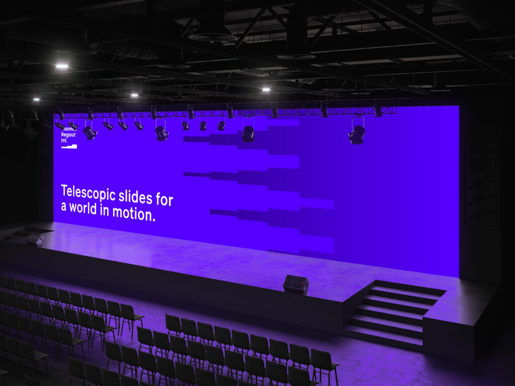
Through workshops with the client, we developed a new brand story and several guiding principles: archetype; The Sage, core values; Solid, Smart, and Aware, Positioning; “Telescopic guides for a world in motion”. These building blocks inspired the development of the visual identity.
The new positioning clearly expresses what we’ve always been internally, and our customers appreciate the fresh look.
Essence captured in simplicity
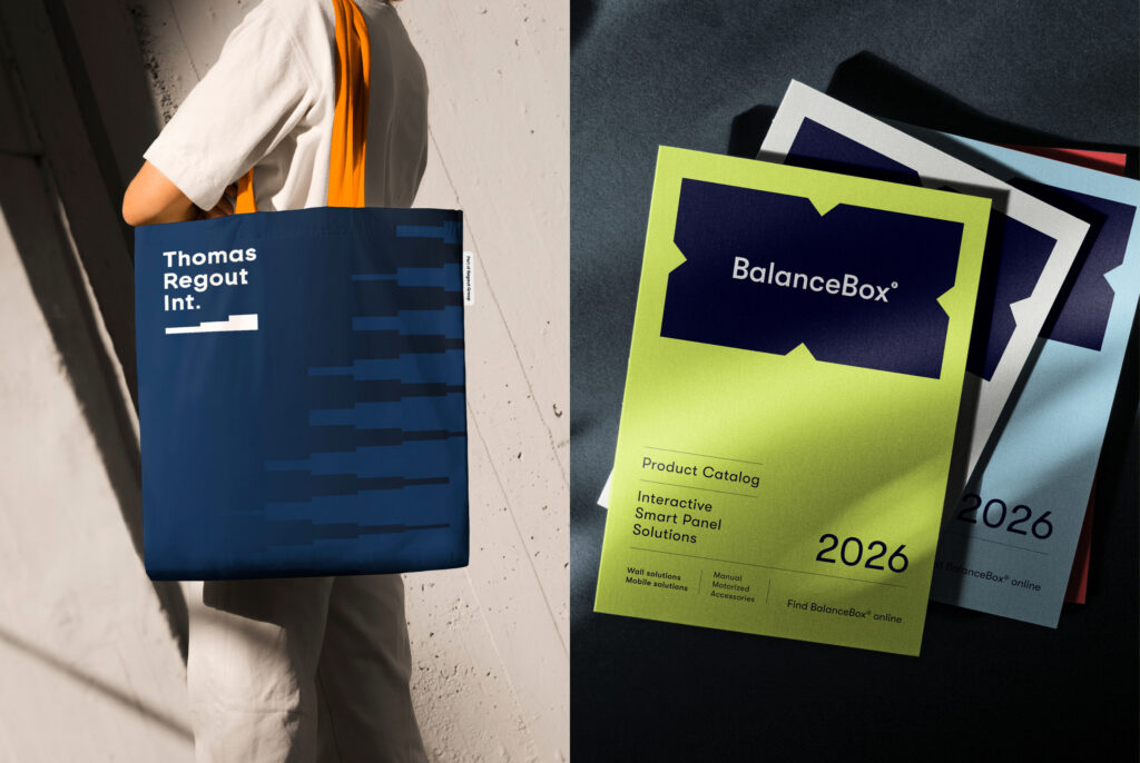
The wordmark and logo feature a cascaded structure that embodies the essence of a guide. The color palette reflects the brand story and core values, while the font combines solid strength with a human touch. Craftsmanship and technological innovation are portrayed through close-up photography. A custom illustration style adds clarity with a human dimension.
Configure your ideal product
The standout feature of the Thomas Regout International website is the product configurator. It allows customers to assemble their ideal guide based on specific requirements—especially useful when developing new products and exploring possibilities.
Identity of BalanceBox
BalanceBox enables inclusive collaboration with height-adjustable mounting systems for interactive screens and whiteboards, ensuring everyone in a learning or working environment can participate optimally.
Shared strategic starting point
Regout Balance Systems previously used the product names BalanceBox, e-Box, and Height Adjustable Mounts, along with the domain heightadjustablemounts.com. Since the name BalanceBox was already familiar to customers, and the decision was made to add “a Regout Group Brand” to the branding. The recommendation was to adopt BalanceBox as the company name, paired with the domain balanceboxmounts.com.

16:9 Full of symbolism
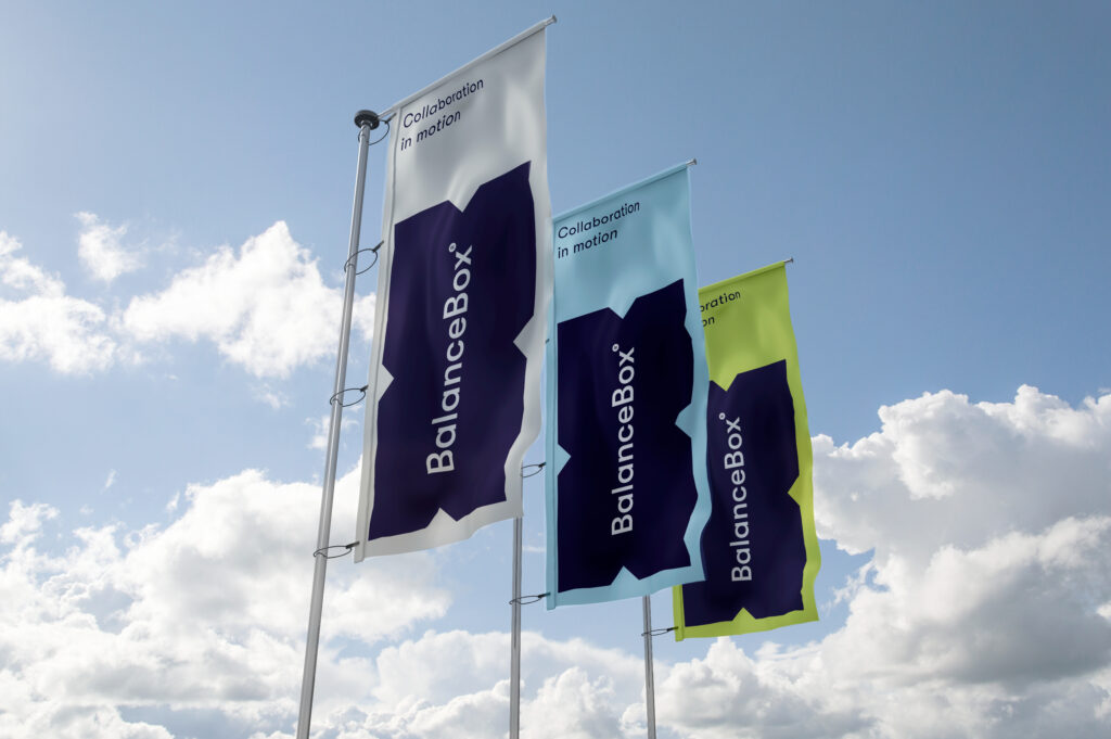
The new logo is rich in symbolism. The 16:9 format is a nod to the digital world. The “arrows” formed by the notches represent the product’s movement (up and down) and the accessibility it provides (social inclusivity). The name, set in a balanced font, is perfectly centered, emphasizing perfect balance. The color palette combines trustworthy blue with energetic green, impactful red, and connecting light blue. A mix of clean product photography and interactive user imagery brings together the technical and human aspects of the products.
Practical tool for ideal height
In addition to providing more information about BalanceBox’s offerings, the website includes practical tools. Thanks to the height calculator, customers no longer need to guess the perfect mounting height for their BalanceBox. The specially designed support center also offers numerous downloads and installation videos. This aligns perfectly with the archetype of the ‘Ally’ and highlights how BalanceBox partners with its customers.
Stronger towards the future
With the renewed positioning and branding, Thomas Regout International and BalanceBox now have a strong and consistent identity that provides clarity both internally and externally. Colleagues, customers, and partners respond positively to the fresh style and clear communication. Both companies continue to build their positions in the international market, with a solid foundation for the future.
