20 October 2022
Simplification is the Trend

Total Design contributed to an article in the latest Fonk Magazine. We would like to thank Fonk and especially Nicolette Hulsebos to interview us on the latest design trends.
#1 The QR code is now part of our lives, we see it everywhere and it is widely used, especially by younger generations. What’s next?
(For QR code with work by Total Design, see page 53, ed.)
‘The QR code as an optical label containing digital information is very powerful. Information is easily linked and users already know when they see a QR code that more information is available. For example, Total Design used it in the Grand Art Game we developed for the Hermitage Amsterdam. Using QR codes gave us the opportunity to integrate a digital experience while visiting a museum. With the rise and popularity of applications such as Snapchat and Google Lens, technologies like Augmented Reality and digital object detection are developing at a rapid pace. This makes it possible to use not only QR codes as information containers, but even as everyday objects. Brands are already capitalising on this, such as Jeep Canada in collaboration with Snapchat. A Snapchat user can scan the grill of a Jeep after which the user will be redirected to the website. With this, Jeep aspires to better align with the customer journey of young car buyers. As the digital world becomes more integrated into everyday life, there will be less need to use QR codes. Everyday objects can start to contain digital information without the need for a QR code.’
#2 Visual simplicity: how is this evolving? Or are we heading in a completely different direction?
‘Minimalist design ensures clear and optimal message delivery. Many brands try to get to the essence. That is not ‘simplicity’, but rather a strength. Minimalism is therefore bound to stay. The ‘less is more’ trend is not only aesthetically appealing, but also functional. Incidentally, ‘less is more’ is certainly allowed to include colour. Whereas people used to think that ‘less is more’ consisted of black and white. On the other hand, a trend is also emerging in which many three-dimensional design elements are used. Unique and striking compositions can be created with these and it provides an extra level of depth.’
#3 Pastel shades have been doing well for a few years now. But will it stay that way now that our economy is shaking on its foundations?
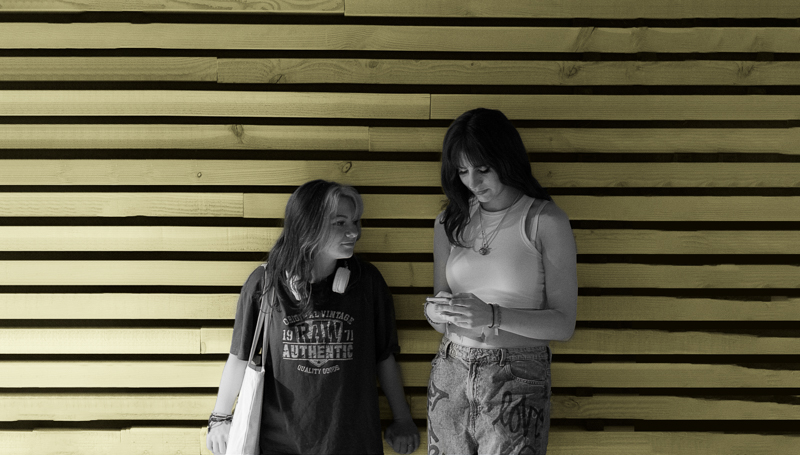
‘This is an interesting question. As far as we are concerned, the reason pastel shades have been doing well for another few years is the same reason why the economy is shaking to its foundations; we are living in uncertain times. As a result, brands are increasingly forced to think carefully about what values they want to be associated with. This means that these days there is as much emphasis on the message as the look. Pastel shades generally work very well for this because they exude peace, calm and softness. And pastel shades add a touch of energy. This makes it easy for the reader to focus on the content. There are exceptions, such as the “You can’t camouflage facts” campaign we created for Bellingcat (see QR code on page 53). For the rebranding of EpilepsieNL (see QR code on page 53), for example, we made an important colour choice. This is not a pastel shade by accident. The main colour of the brand is purple; a reference to Purple Day, 26 March, the international day for Epilepsy. It is the colour of lavender which, research shows, has a positive effect on people with Epilepsy.’
#4 What will be the trend colours of 2023 and why?
‘There is no specific trend colour in brand design. For any brand identity, it is important to think about colour. Using colour can increase brand awareness by up to 80%. But, then of course the colour has to be implemented consistently.Every person has different feelings and associations with a specific colour. There is also a clear difference between warm colours (red, yellow and orange) and cold colours (blue, purple and green). Warm colours tend to call for action, while cold colours provide more security. For example, blue represents reliability, security and responsibility (Coolblue, Financial Services, Facebook, HP, Oral B). And green for stability, calm, health and balance (Landrover, Starbucks). Red for love, anger, passion and hunger (McD’s, Coca Cola). And brown for simplicity and sustainability (Nespresso). etc. Combinations are of course possible; by consistently using the colour blue, Coolblue creates a safe and trustworthy environment. With the orange colour, it becomes more playful and less formal. Another function of the colour orange is attention-grabbing. Watered-down colours are used slightly more often, though. This makes a brand softer, friendlier and more approachable. A big advantage in using toned-down colours is that you can always combine a main colour with them, which in turn creates a good balance.’
#5 Fonts: after the 50ties fonts (as seen at De Bijenkorf and Gucci, among others) and 70ties fonts (BlueBand, Pieter Pot), what can we expect a new image-defining fonts?
‘There are several trends in fonts. All with their own reason. For instance, expressive-and organic-letters are on the rise again. Art Nouveau-inspired. This trend is all about creating text that is fluid and natural. This style can give a design personality. And is perfect for conveying humanity. Serif fonts are also making a comeback. This is part of the return of more traditional and classic design elements. Serif fonts lend themselves perfectly to adding a touch of elegance. Non-traditional Serif fonts will also make you stand out among the crowd. Many fonts are currently being developed that are digitally accessible. For HEMA, for example, we worked with Monotype to develop the HurmaHEMA (see QR code elsewhere on this page). The new HEMA typography improves accessibility and readability. A moral obligation of good accessible typography, both on the website and on the shop floor. After all, HEMA is there for everyone. And going back to question 2; this again ensures visual simplicity.’
#6 The rapid rise of responsive logos that do well on all devices means that visual sameness is lurking. True or false?
‘Definitely not true. Technology and humans have long been linked. In that sense, we have always had to adapt our expressions to the context and technological possibilities. So in that sense, logos have always been responsive. Logos, for example, were mainly in black and white at the beginning of the 19th century because the main media expressions were printed only in black and white. So responsive logos have been in use much longer than the internet. So we are not worried about visual uniformity. We do see that, with the rise of digital media, it is becoming much more important to make responsive logos fit together well, so that the brand is experienced in the same way across all media outlets. The rebranding project Total Design did with HEMA is a good example of this. The reach of brands is growing enormously, and so logos and visual identities also need to suit a larger target group. Brands will therefore be more inclined to bring logos and their media expressions “back to basics”. Simplification is the trend.’
#7 As far as applicable to your own work: what new trends can be expected in general?
Big changes are taking place in the world. Faster than ever before. Change arises out of necessity and desire. Therefore, we expect brands to take action and drive progress. We only have time for the brands that are relevant to us. Brands that move us forward. At Total Design, we help brands find their purpose and deliver on their promise. We do this by aligning the creative power of design, communication and technology. And helping brands to be credible at every touchpoint. Like for Radboud University with the ‘Influencer campaign’ (see QR code). The University is taking a big step in its mission to make a significant impact on the future as a university. As such, the university is making the topic of sustainability a permanent part of every course of study. Many companies are working to radiate and promote inclusion. With the world becoming more diverse, it is important to express this as well. We will see more designs featuring people from all backgrounds and cultures. At Total Design, for instance, we created the iconic rebranding for the Reading and Writing Foundation (See QR code). The mission of the Reading and Writing Foundation is to reduce and prevent low literacy in the Netherlands and Europe. Accessibility and recognisability for a wide audience had to be increased with this rebranding. This is how we help brands help people. It makes brands successful and it also makes us personally feel good to be able to contribute to that.’


