03 August 2021
Platinum and 2 Silver Awards for Total Design at Graphis International in New York

We are very honoured Total Design is one of the big winners at Graphis International in New York. In all three awards were won: Platinum for the new corporate identity for Utrecht Marketing, Silver for the Reading and Writing Foundation and Silver for the revitalisation campaign for the Chinese village of Dafang.
Graphis International is committed to presenting and promoting exceptional talent in Graphic Design, Advertising, Photography and Art/Illustration. In addition to the Award festival, this will be done by, among other things, the publication of an Annual in which this year extensive consideration is given to Total Design with an interview with the creatives behind these projects.
Utrecht Marketing - Platinum

Utrecht Marketing needed a new corporate identity, a further development of the style that we already developed in 2009. The corporate identity had to be renewed because the playing field in which Utrecht Marketing finds itself has become increasingly international. The objective of Utrecht Marketing is to stimulate economic growth and strengthen the substantive values of the city brand. This means that the new corporate identity is not only aimed at residents and visitors, but also at (international) companies and talent.
The logo and corporate identity are based on the coat of arms of Utrecht. The diagonal red area refers to the story of Saint Martin who cut his cloak in two to share with a beggar, which symbolizes two important brand values for Utrecht, “sharing and connecting”. The U is already widely used in Utrecht. And since the U has the shape of a shield, the link was clear. The idea of “sharing and connecting” was subsequently carried through consistently throughout the corporate identity. There’s a small number of simple rules put in place, which guarantees complete freedom for communication while maintaining recognizability. The diagonal of the Utrecht coat of arms is the driving force of the style. It resembles a division sign, and as such symbolizes the value of “sharing”. Every communication item must use it in some way, but in what way exactly is mostly free. It can divide up colour fields or images in a multitude of ways.
As of 1 July 2020 the new corporate identity is in place. The simple rules ensure that all expressions are immediately recognizable as from Utrecht. So the result is not only recognizability but, with the “sharing” division sign, also a constant visible engagement with the stories, customs and attitudes that are quintessentially Utrecht.
Dafang Holland Creative Village - Silver

Dafang is one of 150 traditional Chinese rural villages in Jinxi County Municipality in southeastern China. As in many places in the world, the countryside in China is facing a population decline. China is making an enormous effort to revitalize its deserted countryside. The stimulation of rural tourism has an important place in this effort. In this context, Jinxi County council has asked the Dutch IVEM to transform one of its villages into a tourist attraction where the younger generation of Chinese urbanites would like to visit. IVEM chose Total Design to design the village’s new visual identity.
We made a logo and a styling. The development plan for the village was based, among other things, on an iconic building for visual marketing: a beautiful tower in the form of a double helix. An abstraction of that tower has become the logo. Furthermore, with a mix of floral styling and styling based on traditional porcelain motifs, we have laid a foundation for the marketing of all kinds of products that will be on view and on sale in this Holland Creative Village, from bags and clothing to beer bottles.We followed up on the request to use gold as the dominant color in the eventual development of the logo and styling. Jinxi means ‘golden flow’ and that symbolic, almost narrative concept is still so much valued that it can be dominant in the final design.
Dafang Holland Creative Village has recently opened, attracting already thousands of visitors each day, as China has started to open up post Corona. The project is now regarded as an example project by the province of Jiangxi, in which Dafang is located. The success will be replicated in more villages throughout the region.
Reading and Writing Foundation (Stichting Lezen en Schrijven) - Silver

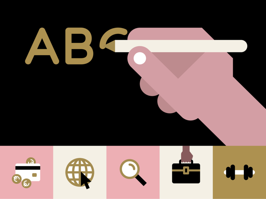
One in five European adults has difficulties reading and writing. Stichting Lezen en Schrijven’s mission is to reduce and prevent literacy difficulties in the Netherlands and Europe. They asked us to revitalize their brand identity, to increase their accessibility and recognizability for a wide audience. And so bring coherence to the brand, ensuring sub-brands and campaign materials are recognizably theirs.
As the basis for the concept we used illustrations constructed in an iconic style with geometric shapes and a strict color palette. The illustrations don’t just create an iconic identity, they also serve the practical purpose of making texts more accessible for a less literate audience. The illustrations are never an end in themselves, but are always used to strengthen and clarify the text. This is already clear in the logo, where an eye (reading) and a pencil (writing) visualize the name of the foundation, and at the same time the simple geometric illustration creates an iconic brand. In the same way ilustrations and text always go hand in hand, throughout the entire identity. The minimal color palette ensures coherence and recognizability. The colors underline the human aspect, with their skin tones of light to dark pinkish shades. A strong ochre, black and two shades of white complete the palette. The range of five skin tone shades ensures diversity in the images, as hair is always shown as black, hair color can never become an issue. Accessibility is key in today’s brand identities and communication styles, especially when it concerns NGOs or charities. And literacy is not the only topic that needs to be accounted for. But when accessibility becomes a starting point, instead of an afterthought, it will feed creativity rather than constrain it. This is what we discover more and more, and the Reading and Writing Foundation’s style is just one iconic example where this truth emerges. Not just the illustrations and their colors drive accessibility, but also the typography and lay-out principles.
During the design process we had to remain critical about accessibility at every step. This had an impact in our choices for typography, color, layout and illustration. We learned a lot about readability and which type families are most accessible to less literate people. That is also why we use a larger type size and leading than we normally would. The resulting style is not just accessible itself, but serves as a showcase for accessibility. When the foundation pushes organizations and governments to become more accessible, their own communication style is used as a tool to show how it is done.


