04 August 2022
With a new strategy comes a modern and open visual identity for HEMA

Total Design develops a customized visual identity for HEMA that fits seamlessly into HEMA’s strategic direction.
Made with love
HEMA’s mission is to create a better everyday life in a more beautiful world. For HEMA, everything is made with love, with a focus on more practical, beautiful and better design. Products that last longer. Unique by the recognizable ‘Dutch Design’ handwriting. All this while preserving the affordable character.
The new strategic direction that HEMA has started since the end of 2021 includes a refreshed and modern identity. Total Design has been asked to develop this rebranding, while maintaining the HEMA-identity, but also focusing on the future. Real Dutch Design; minimalist, experimental, unconventional and with a sense of humor. An identity that only the HEMA brand can afford.


A modern identity.
A bright and cheerful look with lots of openness and contrast has been chosen. It also shows more boldness through a lot of use of white. This has created more space for the stories behind the products. HEMA products are literally given a stage and the special product features are highlighted.
As is well known, the HEMA logo is red and forms the basis of the visual identity. But this color is used sparingly, only the logo and promos are red, all other elements are always a different color. A new, accessible color palette was developed for this purpose. For a store that wants to be there for everyone; diverse and inclusive.
The new color palette is based on the brand values: modern, cheerful, down-to-earth, brave and open. The palette consists only of colors that evoke positive feelings. Colors that make you happy. By making white the primary color, however, the whole remains sleek and down-to-earth.

Accessible typography.
A new HEMA typography improves accessibility and readability. A moral obligation of good accessible typography, both on the website and on the store floor, because HEMA is the store for everyone.


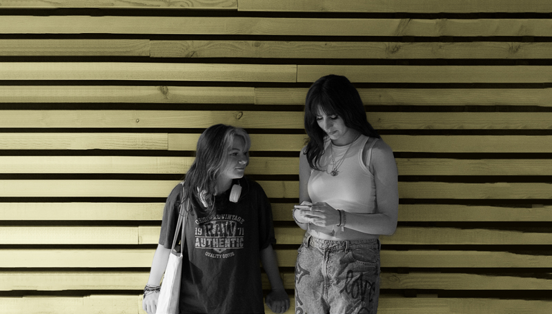
Photography celebrates everyday life.
Photography has also been addressed. There is movement, dynamism and fun in the images. Sunny Dutch light and surprising perspectives are used to create our own style. We don’t need any fuss to put a smile on the face. We show the fun of everyday life which is recognizable and fun!


