Kooyman
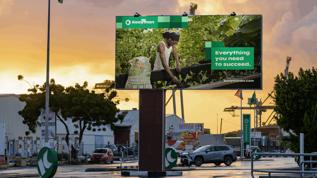
Everything you need to succeed
Challenge
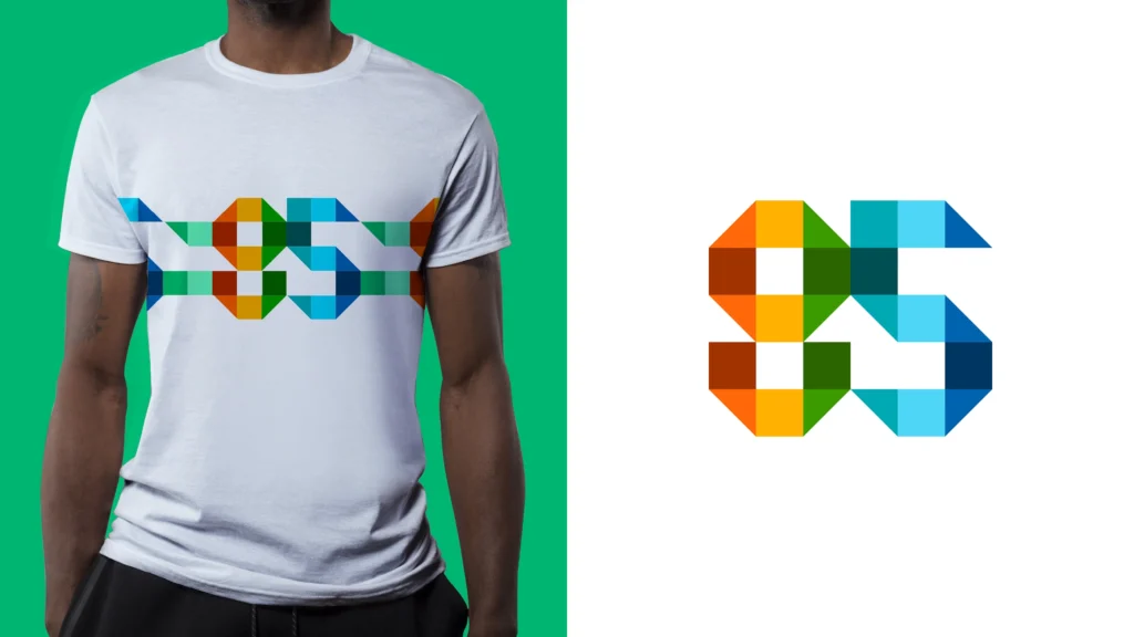
Kooyman, a leading family business in the Caribbean for 85 years (650+ employees,
7 stores in Aruba, Bonaire, Curaçao, Sint Maarten, and Barbados), wanted to position itself for the next phase of growth and greater impact in the communities it serves. The existing brand identity was too traditional and insufficiently connected to the colorful Caribbean culture and close-knit communities on the islands.
Kooyman serves diverse target groups: both B2C (do-it-yourselfers) and B2B (professional builders), with different wishes and needs. This made it difficult to communicate consistently yet purposefully.
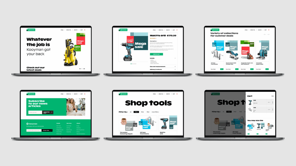
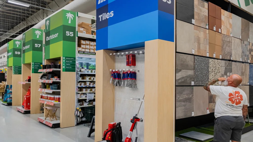
Navigation and customer experience were not optimal: the website and other touchpoints lacked structure, making it difficult for customers to find what they needed.
Idea
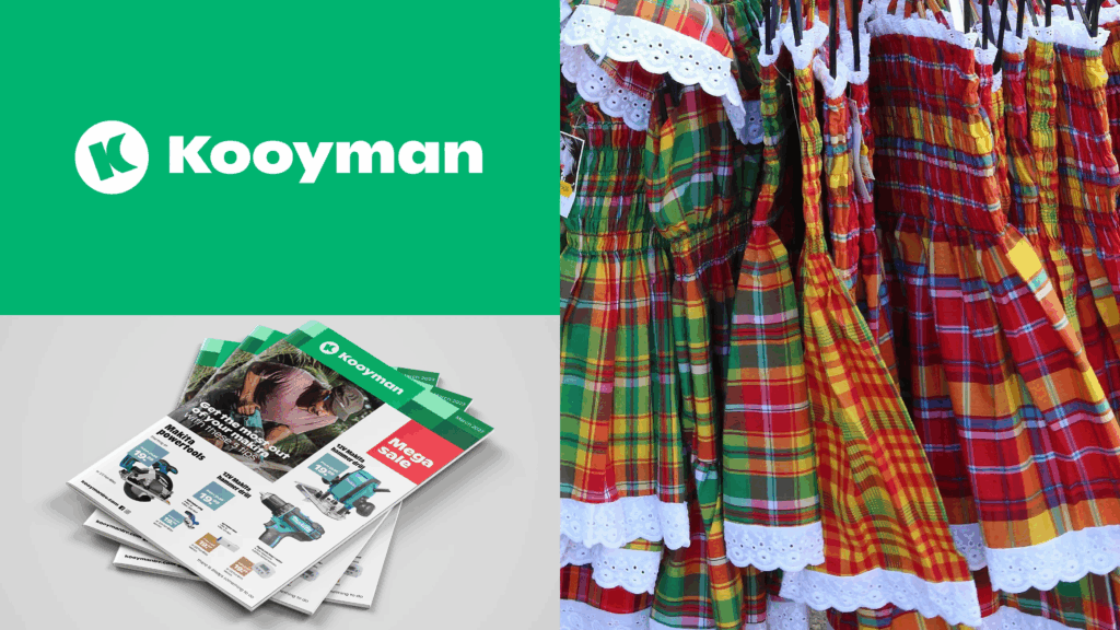
Inspired by the vibrant Caribbean culture,
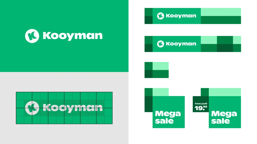
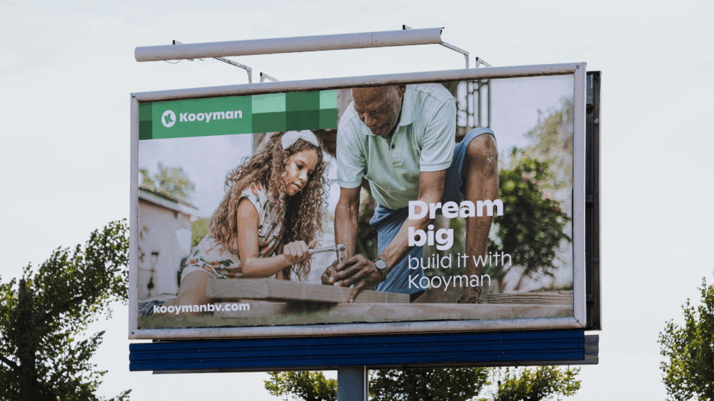
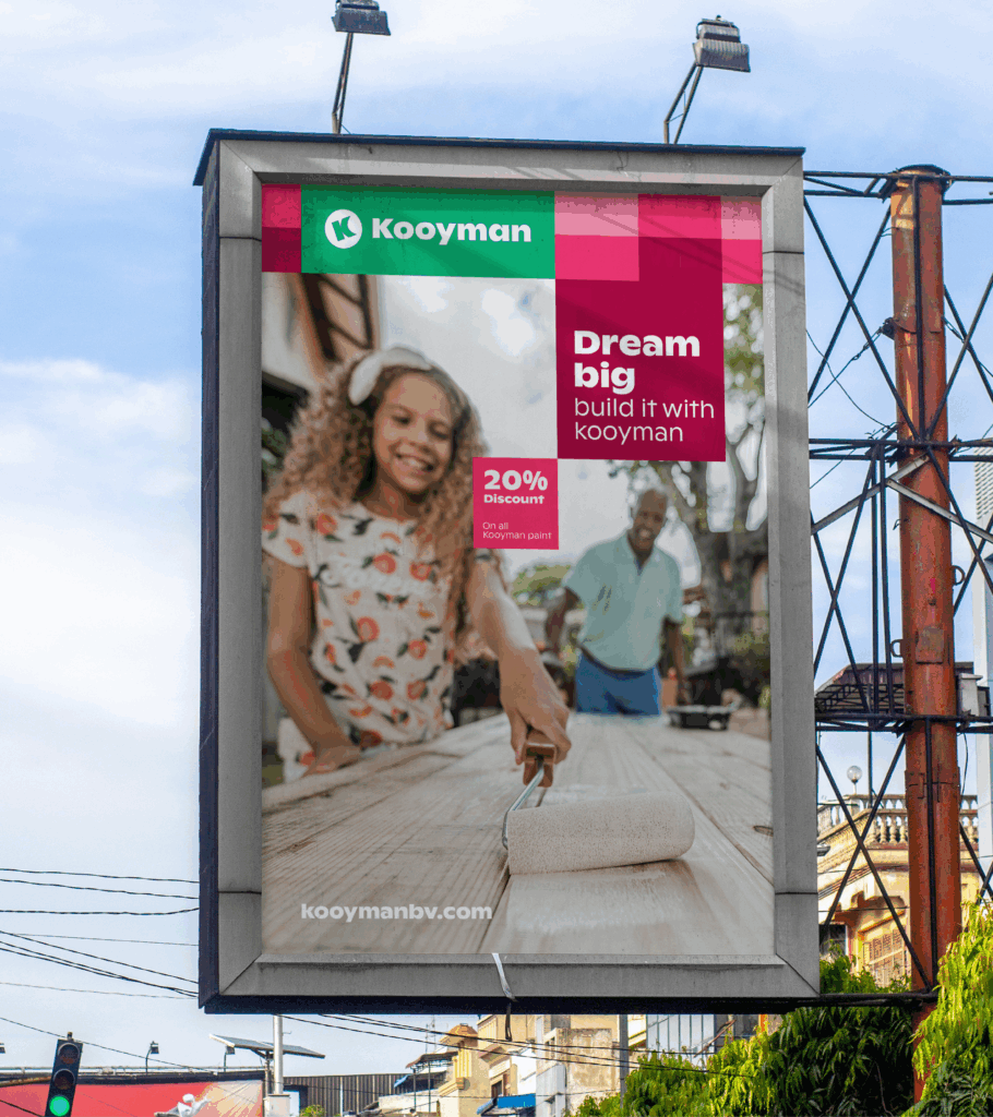
TD drew color and energy from the heart of Willemstad. The distinctive diamond pattern, derived from the traditional Madras, provides both cohesion and flexibility across all brand applications.
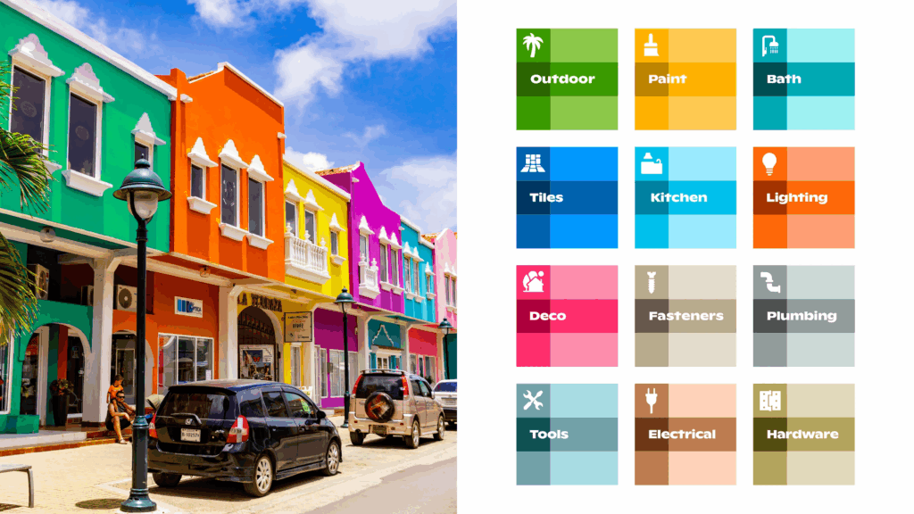
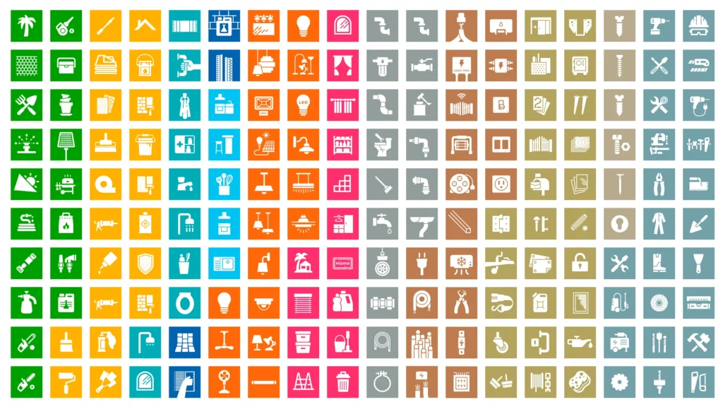
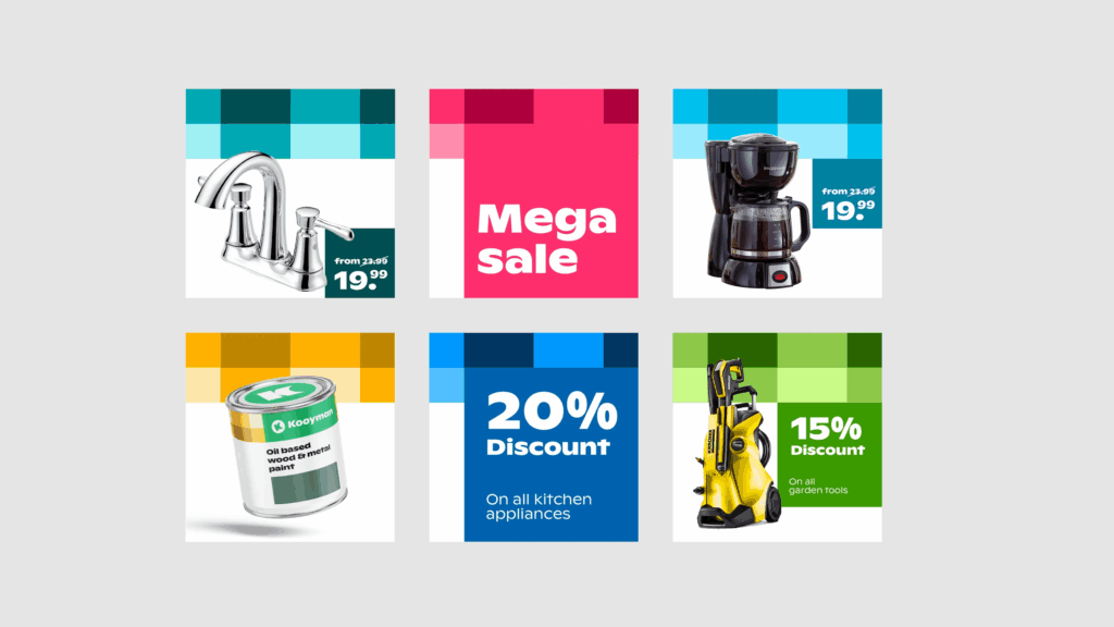
Each product category received its own color, creating clear differentiation and a consistent customer experience. This makes navigation on the website and in stores more intuitive, helping customers find what they need more quickly.
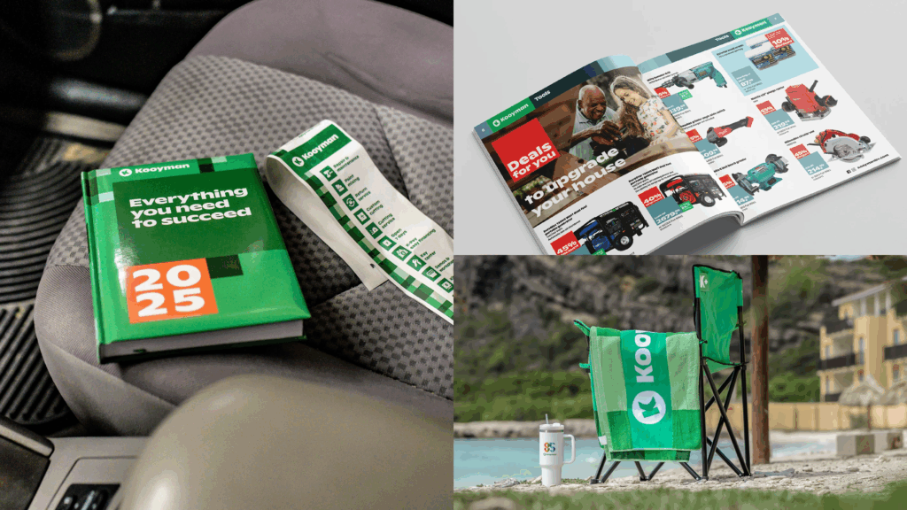
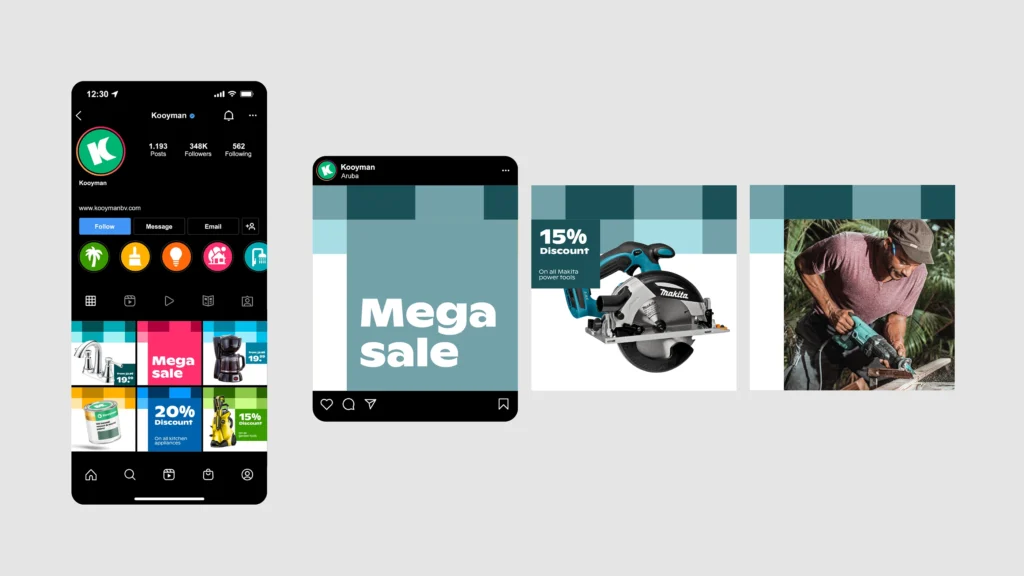
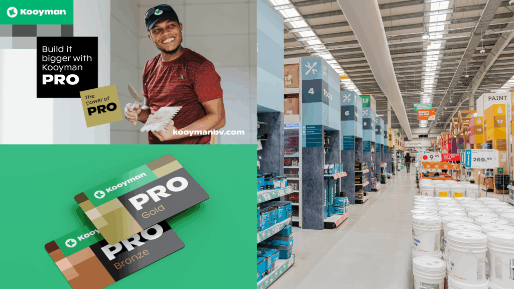
The familiar Kooyman logo has been subtly modernized and paired with a playful, rounded sans-serif typeface to enhance readability. In collaboration with Tambr, a characteristic sound library was developed to honor the brand’s Caribbean roots. A multi-island photoshoot captures the diversity of Kooyman’s communities, with people-focused photography strengthening the connection to local customers.
Result
A festive 85th anniversary celebration for Kooyman with a new identity. After the rebranding, Kooyman recorded record growth in both online and physical sales, as well as a strong increase in social engagement and website traffic. The new identity provides a solid foundation for the long term with consistent guidelines and scalability.
Thanks to the design system and segmentation by category, the brand identity is now easier to manage and applicable to all departments and channels, both internally (employees) and externally (B2C & B2B).
Color and iconography allow Kooyman to differentiate itself more effectively in its communications.