Schiphol
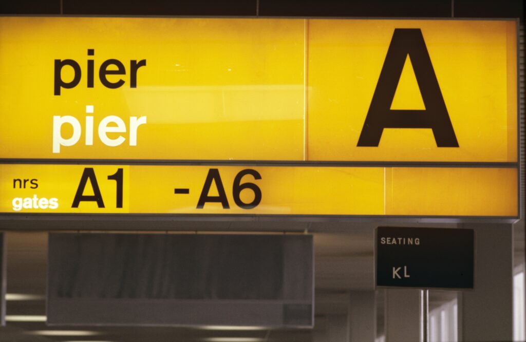
How we set the global standard for airports
Challenge
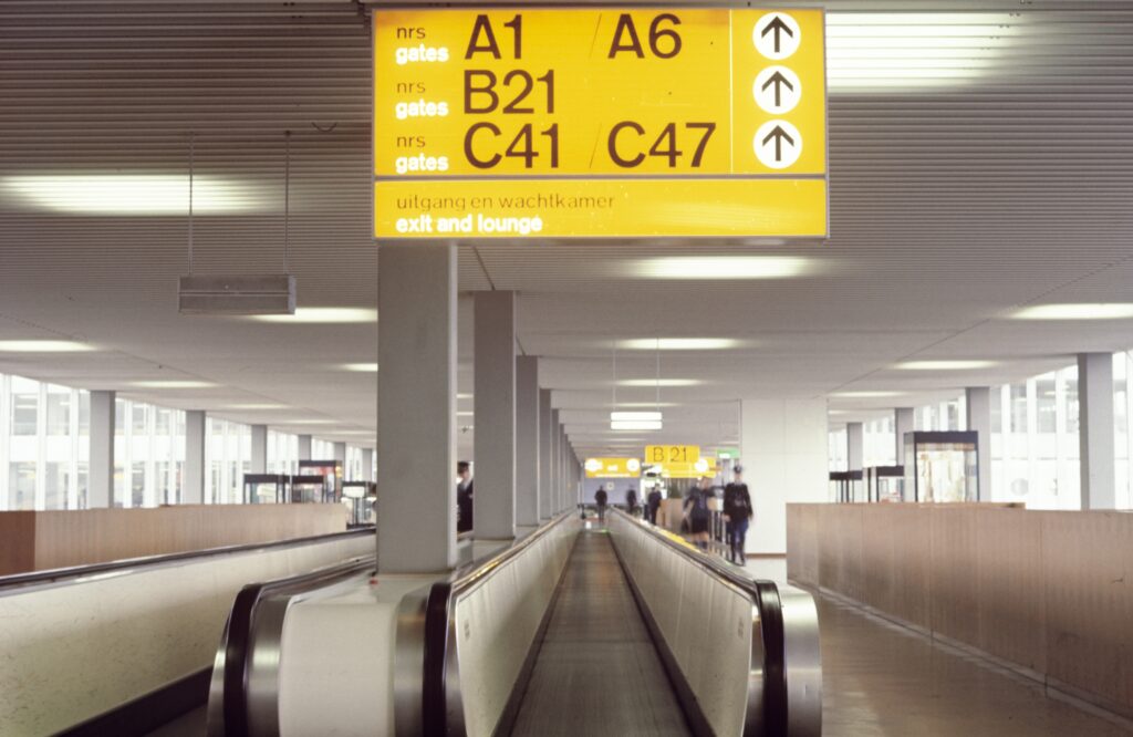
In the early 1960s, airport signage was chaotic. Signs were hard to read, icons cluttered, and travelers struggled to find their way. For an international hub like Schiphol, clarity wasn’t just helpful – it was essential.
Idea
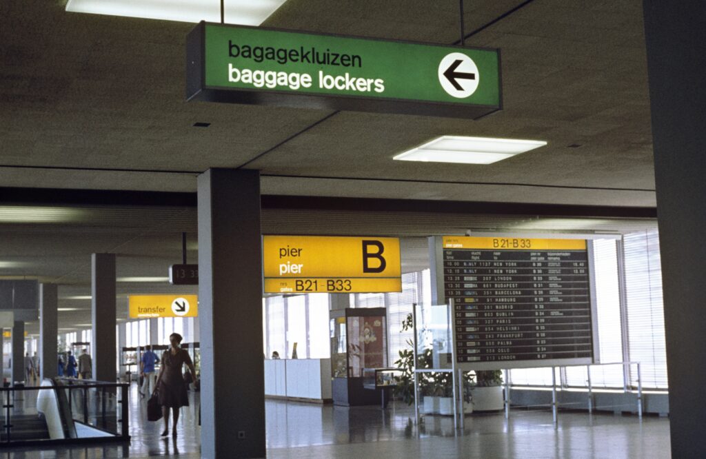
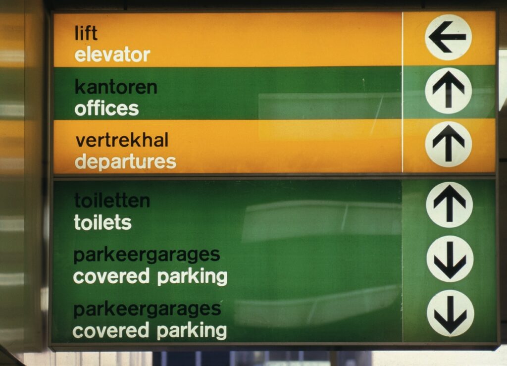
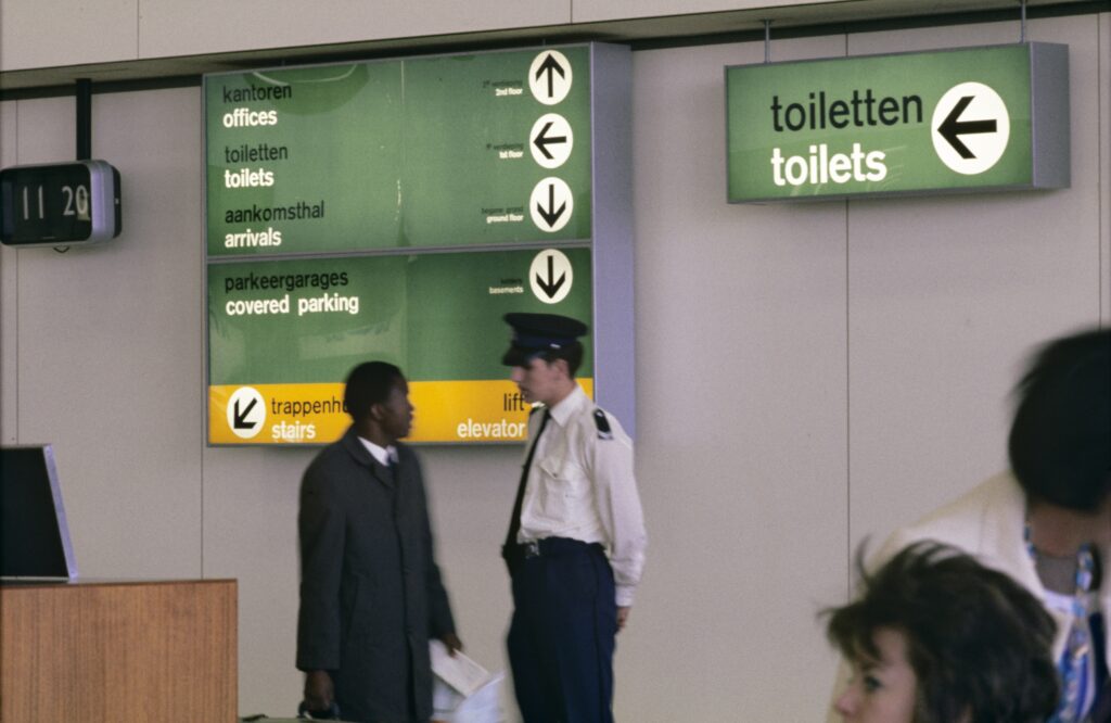
Total Design created a radical new system: large overhead signs, placed across the walking direction for maximum visibility. Yellow for main routes. Green for secondary information. No icons – just clean, functional typography: Akzidenz Grotesk, prefectly readable from a distance. A simple but groundbreaking idea.
Result
Schiphol signage became iconic – and a model for airports worldwide. Functional, clear,and timeless. Decades later it was updated with pictograms and Frutiger typeface, but the principle remains unchanged: guiding people through clarity and simplicity.
A standard first set by Total Design – and still shaping how the world moves today.
Quote
“Schiphol’s wayfinding by Total Design shows how clarity endures – design as function, not ornament.”
