Colourful Restyling of Laurentius Hospital’s Visual Identity
Laurentius Hospital is a general hospital for the residents of the Central Limburg region. After defining their strategic direction “On the way to a healthy future” it was time to critically assess the logo and visual identity. Do they still accurately reflect the story the organisation wants to tell? With that question in mind, we began a collaborative process. We preserved what worked well, refined where possible and added new elements where needed. The result is a versatile brand identity ready for the future.
Non-stop colour
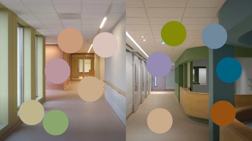
Perhaps the most striking feature of the restyled visual identity is the extensive color palette, consisting of no fewer than 24 colours. These were carefully curated by visual artist Peter Struycken for the hospital’s interior during its renovation and expansion. Since these colors were already deeply woven into the hospital’s physical appearance — and thus into the public’s perception — it was a logical choice to fully integrate the palette into the visual identity. This adds a strong sense of personality.
Logo and brand architecture
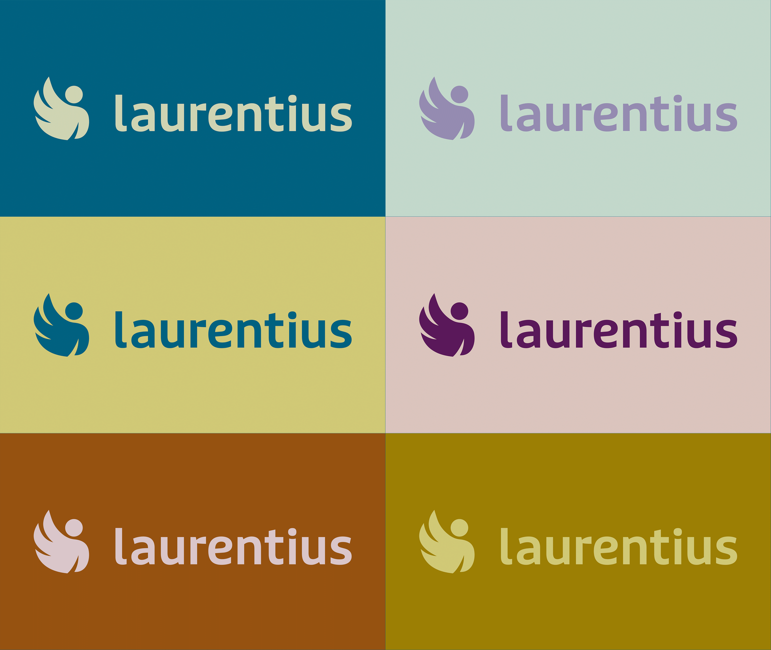
To enhance recognition and create a stronger presence, a monolithic brand architecture was chosen. From now on, everything operates under one name, one brand and one mission. This is reinforced by repositioning the logo from above the wordmark to the left of it. Additionally, the multicolored elements in the logo and wordmark were removed and replaced with a single color. This not only creates more unity but also allows the logo and background to adopt any variant from the color palette more easily. Finally, the typography was subtly adjusted. The letters are slightly rounder, better reflecting the core values and ambitions.
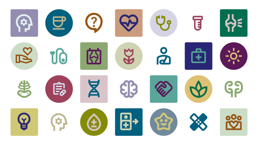
Soft-shaped icon set
A small set of icons was developed, designed to match the soft shapes of the logo. These icons are used flexibly. Sometimes taking center stage, other times playing a supporting role.
Together, all these brand elements create a rich visual identity with a warm, human feel. It provides a solid foundation for the Laurentius Hospital marketing and communications team to carry out the rollout themselves.
“Our new visual identity perfectly aligns with what Laurentius stands for and strives toward.”
Warm and human appearance
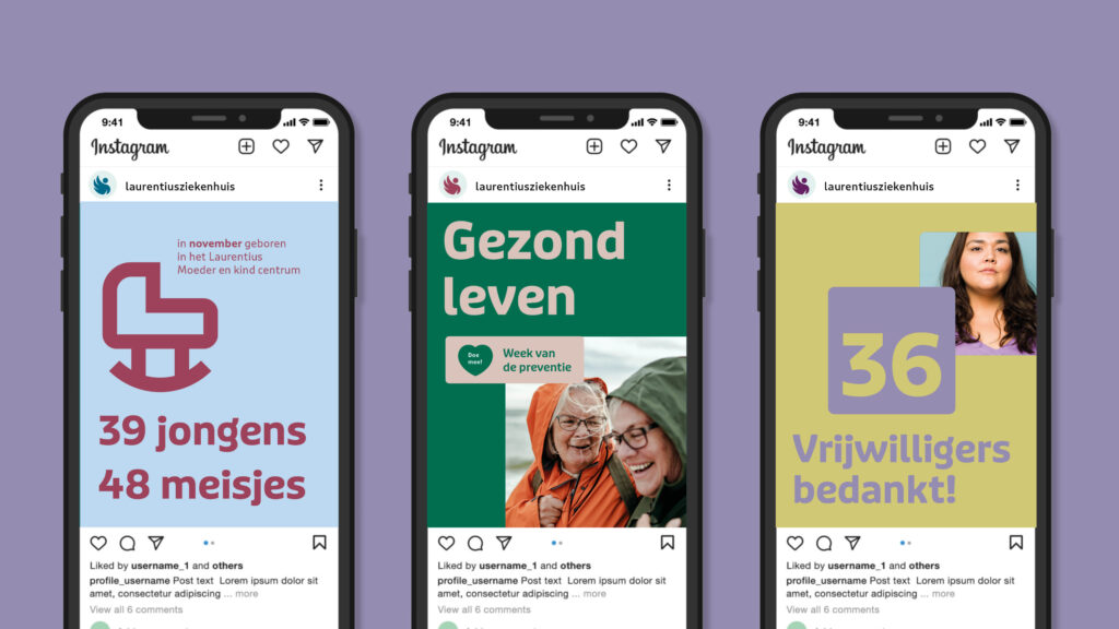
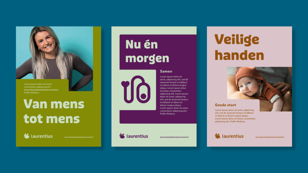
The cohesive color scheme of earthy tones and their cooler counterparts ensures that Laurentius can always convey the right mood and atmosphere in its messaging. The design plays with color blocks featuring rounded corners (inspired by the logo and architecture), combined with colored text. Layering these elements creates a playful depth with many possibilities for variation.
People at the center
Laurentius stands for a human-centered approach. This applies to both patients and staff. It’s the person behind the patient or employee that matters. That’s why people are photographed as themselves. In the concept photography, staff wear their own clothes rather than uniforms. In corporate photography, uniforms are worn, but the images clearly show the connection between the person, the professional and work environment.
